


When I first conceived of Ackerly Green, I established the style and branding in a much more “classic lit” vibe. Lots of emerald greens and blacks, filigreed gold monograms, worn edges, and ornate design elements. I LOVE that vibe, but as we wrapped the events in The Monarch Papers and properly launched the company, that style and branding felt more like the classic, decades-old Ackerly Green Publishing of the in-world narrative, not the modern, interactive company we would launch in 2019.
I had an itch to create a logo and new branding, but it wasn’t until we finally decided to not just be a traditional publisher but really embrace the immersive, interactive storytelling that put us on the map, that I knew we needed branding that would really convey that.
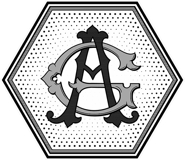
We needed a new color scheme, we needed new typography and branding elements, and most of all, we needed a new logo. To refresh your memory, this is the company logo I used when The Monarch Papers started, and the logo that the in-world AGP used as well:
It was perfect for the time. Established, monolithic, classic, and the hippocampus added a hint of fantasy.
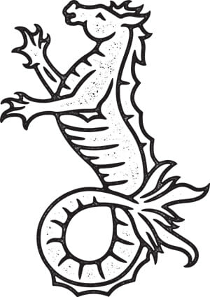
But I had no idea at the time how useless a logo that is both wide and tall and has to be read would be. Once The Monarch Papers ended, I wanted something that was more useful, iconic, and one that could be pared down and exist on its own, on a book spine or social media avatar. Working with the amazing Kirstin Bencomo, we came up with this:
Again, I think it’s a great logo for a traditional publisher, (or the in-world equivalent of our company.) On their own, they’re both great. But as we veered more and more into “21st-century storytelling” where our readers would be a persistent force in the expanding narrative, neither of these felt… right. Nothing about either of those logos says immersive, mysterious, magical, or interactive. They don’t convey what we’re trying to do, and who we are trying to attract. If we were going to enter a super-crowded publishing marketplace and try and stand out as something different, we needed every piece of branding to convey the unique thing we’re doing.
So working with the incredible Liam Ashurst, (who first redesigned the classic guild badges) we set out to figure out how we could better convey what makes us different and what we provide our brave readers.
Liam is so in demand that I had about four months from when I hired him to think about the new branding before he was actually available to work on it. But it was really early on in the brainstorming process that I latched onto the idea of a keyhole as a central motif. It conveyed something hidden, a mystery, and it also intimated that there was something to unlock. Something to solve. Catherine (my assistant) and I also read a book together called Building A Storybrand that also got us thinking about our position in the market, what we were providing our customers, our readers, and how we could best express that. And that’s when the keyhole concept really took off, for me at least, because I love the idea that Ackerly Green is that keyhole, that enigmatic portal to another world and our customers are the key.
I still wanted texture and age, but as much as I wanted to eschew the tropes of modern publisher logos (books, glasses, someone reading, etc.) I also knew that there had to be something in the logo having to do with a book, or reading, and something magical to tie in our core concepts that the keyhole didn’t. We needed mystery, interaction, magic, and reading. No small feat.
It took Liam and me bouncing ideas back and forth to come up with this:
For me, it’s like looking through a keyhole and finding a spell book unfolding in the room beyond. That feels like Ackerly Green to me.
But we didn’t stop there. I had also latched onto the keyhole concept because it’s made up of two shapes… a triangle and a circle. Just like the letters A and G. Liam created a variant logo that also acts as a monogram and will be used in special places like book spines:
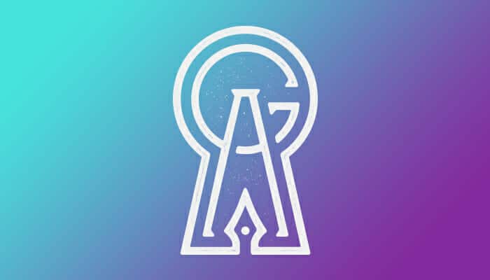
I love the fountain pen motif in there too.
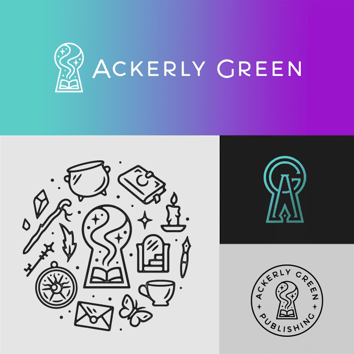
Because Liam’s amazing, he also created a design variant that integrates a lot of iconography from the Magiqverse:

He posted it on Instagram a couple of weeks ago, before I was ready to reveal the keyhole as the new logo. He asked if I wanted him to take it down, but I thought I’d use it to my advantage and share with the AGP community to get their thoughts before they knew it was the new logo. It went well. 🙂
I also wanted a logotype (a company name written out) for use on the website and paper materials, but as before was wanting to try a typeface that was a little more modern and less… serif than the typefaces we’d been using. Liam updated the sans-serif typeface Monserrat with little swoops and interesting tweaks that made it unique to our company (you can already see it on the AGP site’s header menu.)
I’m really pleased with the redesign. Even though it challenged my ideas and prejudgments about current logo design, I feel it really conveys what we’re doing here in a modern, fun, and magical way while providing a lot of variety in branding strategy so it can be used, in different forms, in a lot of different ways. And you’re going to see it start rolling out on the site, forum, and social over the next month:
And though we’re keeping the current Herman (don’t stress @Skylad,) Liam also did a polish of Hermie to work with the redesign:
I finally feel like what our branding conveys what we’re doing here at Ackerly Green and will take us into the foreseeable future.
It only took four years to get right. :cjheart:
I don’t know about you, but that keyhole logo looks like a mighty fine tattoo.
9 Comments
Oh wow I love seeing the evolution of the logos and branding. The new keyhole logo looks fantastic and the monogram version is really inspired!
I adore all of these so much!!!
I love these new designs! They feel so much more modern magical!
I love the keyhole and its variations. Its really going to stand out and inspire creativity.
It’s ok @CJB it just means that I’m vintage AG


To be fair, the first time I saw the redesigns, it took me a while to get accustomed to them (call me old-fashioned) but I absolutely love the keyhole version and the other ones are also really good! I agree, you achieved what you wanted!
The keyhole monogram is absolutely brilliant. I actually gasped when I saw it. Also that simple lineart Herman would look great on a hat… Crap. I was going to embroider something else and I already made one Herman hat (which I keep forgetting to mail ) but this is giving me so many ideas! I mean, I’m sure you’ve already got merch plans for this Herman so I won’t do it exactly like yours but still…
Oh I definitely need that keyhole monogram as a tattoo!
I may incorporate it into mine…whence i design it.
also! im loving this new branding, and i need to find my herman agian. im sure i put him down somewhere.